Brand Color: Managing Expectations
On February 11-12, 2014, The Sonoco Institute of Packaging Design & Graphics at Clemson University will be hosting a seminar on Brand Color Management. Attendees will learn how to define, communicate and monitor brand color consistency on consumer packaging graphics.
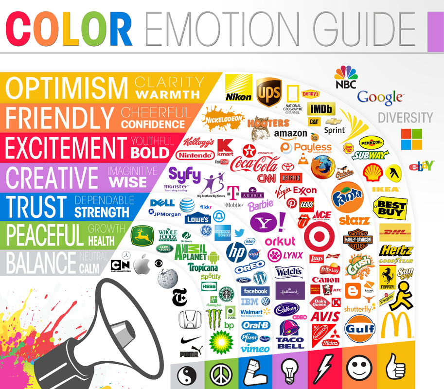
Why is brand color important? It conveys meaning instantaneously, without words. According to a University of Loyola/Maryland study, it can increase brand recognition by up to 80%. A brand’s color communicates brand identity and prompts an emotional response in the consumer, reinforcing their connection with your brand.

It provides the first visual cue to consumers to help identify your product from about twelve feet away. That’s really important when you’re in a store like this one:

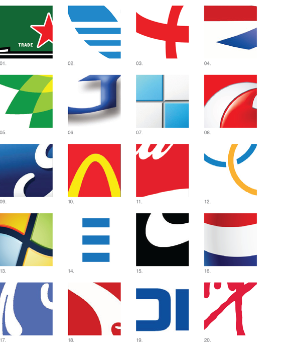
Even when they see just a sliver of your product on that crowded shelf, the shape, size and color of the packaging graphics will help consumers find you more quickly. How well can you identify these logos, using color as the main clue? (You can find the answers here)

Color communicates worth, too. If your brand’s color is shifting from one package to another, it looks as if your brand doesn’t care about quality. If the lemons on your packaging look like oranges, and your lipstick photo doesn’t look particularly kissable, what’s a consumer to think about the product inside, then?
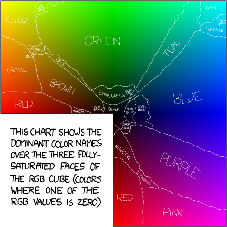
Color perception varies from person to person, and the names used to communicate color can vary by industry, culture, gender, and age. In 2010, a former physicist and web comic artist named Randall Munroe conducted a survey about color naming. His map of the color name survey results shows some pretty big variations.

Making sure that your brand’s color standards for “RED”, “GREEN”, or even “PMS 294” matches across all substrates and print processes means that you and your printers need a common color vocabulary.
CSW’s own Marek Skrzynski will be presenting “Communicating Color and Managing Expectations” at Clemson on February 11. He’ll talk about how to make sure everyone is speaking the same color language and printing within the same color gamut.
If you’re still looking for some kind of Rosetta Stone to help you communicate and manage brand color, you may want to consider attending this seminar. Other hands-on sessions include:
• Establishing Brand Color Intention and Visual Color References
• Specifying Target Colors and Tolerances by the Numbers
• The Workflow of Brand Color Management
• Spot Color and Process Color for Product Decoration
• Presentations Topics Include:
• Brand Color Management: Workflow and Responsibilities
• Color by the Numbers, Systems, and Metrics
• Differentiating and Integrating Process Color and Brand Color
Click here for more information about the Brand Color Management agenda and registration. We’d love to see you there – because color is critical to your success.
Posted by Karen Leet, MarCom Manager
 CSW
CSW